Frederick Benjamin Grooming
Branding | Packaging | Rebrand | Logo Design
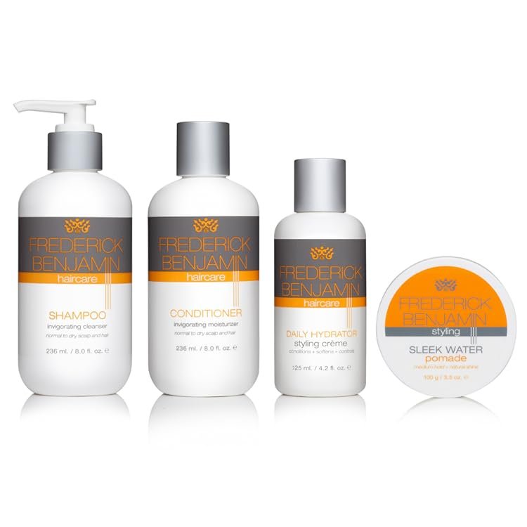
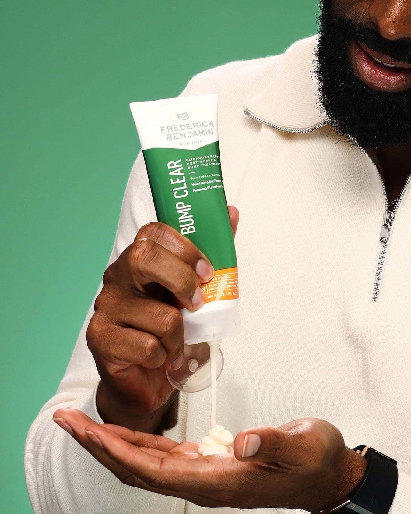
Our challenge was to bring barbershop brand Frederick Benjamin to Target with a refreshed identity and packaging system. Frederick Benjamin empowers men to reclaim their identity and maintain their signature look while staying true to their commitment to healthy and natural active ingredients. Ultimately, they aspire to groom the men who will groom the men of tomorrow.


After
Before

We honored the legacy of carrying tradition forward with a modern and bold brand refresh that stands out on the shelf and equips men to look their best through a streamlined regimen system that highlights active ingredients. The updated Frederick Benjamin logo is a contemporary “FB” monogram connected at the center, honoring the third-generation entrepreneur with three chevrons. The brand wordmark was crafted in Sackers Gothic typeface to convey a caps-worthy confidence that expertly communicated grooming performance.


Agency: KNOCK Inc
Creative Director: Laura Qvale
Design Director: Kelly Bauernfeind
Designer & Art Director: Fuechee Thao
Copy Writer: Lucas Hines
Account Producer: Katerina Sin
Project Director: Paige Alford
Strategy: Talia Camarena
Photography: Bailey Tillman & Frederick Benjamin